case study
KRISTY CAMBRON
Premier Author Website

The Vision
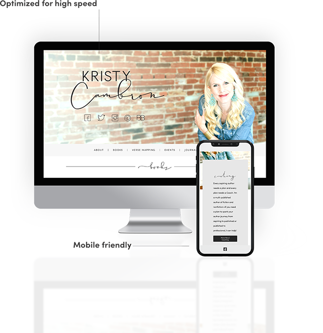
With Kristy Cambron, celebrated author, speaker, and Bible teacher, Jones House was tasked with creating one thing: consistent branding throughout her online presence. From social media to both of her websites, KristyCambron.com and VerseMapping.com, our goal was to create a complimentary design that carried into every aspect of her engagement on the web.
Client wishlist:
"Every aspiring author needs a plan and every plan needs a Coach. I'm a multi-published author of fiction and nonfiction—if you need a plan to spark your author journey from aspiring to published or published to professional, I can help!"
Kristy Cambron
The Logo
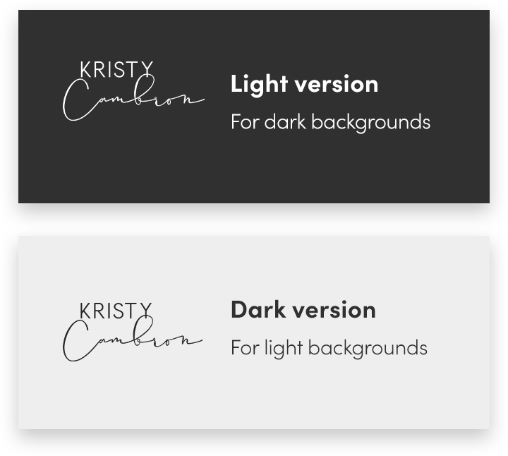
Kristy’s logo was a simple combination using fonts she’d selected for her site’s design. Easy peasy.
A light, serif font for Kristy’s first name is meshed well with a specialized script font used for “Cambron.”
Kristy’s stated vintage design aesthetic led us to choose a bold black for her name. Just like a little black dress, black for a logo is as timeless as ever.

The Identity
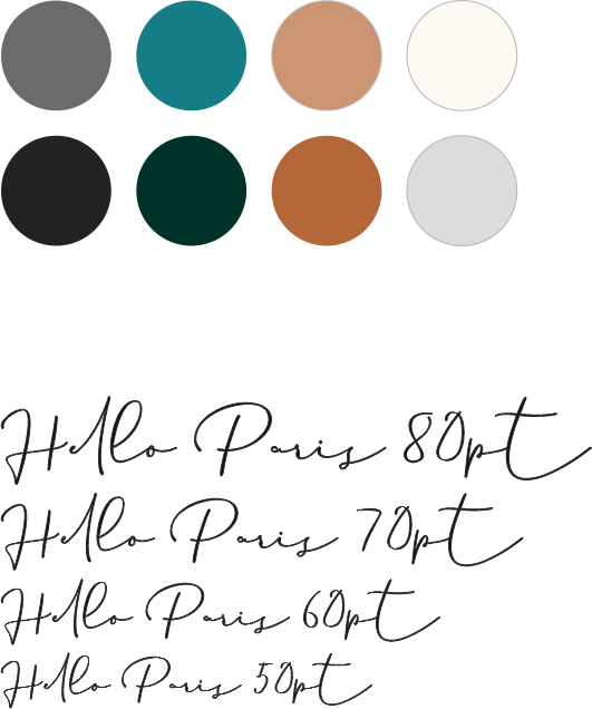
For this design, we were provided a number of high quality photos of the client. Using her preferred images as a guide, we built a color palette of bold teals, brick reds, blacks, whites, and grays.
Adopting Kristy’s chosen script font, Hello Paris, added a touch of whimsical elegance to headings in the website.
The Website
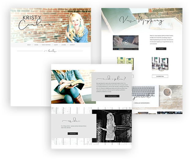
Branding, branding, and more branding. From social media and across two websites, Jones House’s job was to bring a continuity to Kristy’s overall online presence. By listening to our clients, we endeavor to capture their design aesthetic and add flairs of our own to create the website our clients want.
• Responsive sizing
• Optimal speed
• SEO best practices
• Easy edits through Wordpress Admin
