case study
Cynthia Ruchti
Premier Author Website
The Author
Cynthia Ruchti, accomplished author, speaker, and literary agent, has been a long-time client of Jones House Creative. In this, the third website designed for her by Jones House (we love repeat clients!), Cynthia was ready for a massive upgrade. With changing web standards and design styles, Cynthia wanted to introduce an all-new elegance to her online platform.
Client wishlist:
The hope that dispels shadows and lights a heart’s dark corners can light your own. You, too, can confidently say, “I can’t unravel. I’m hemmed in hope.”
My prayer is that you will turn the last page of my books with a satisfied sigh. It will bless me if you say, “What a great story!” It will bless me more to hear, “What a great God!”
Cynthia Ruchti
The Logo
Cythina has long maintained her tagline, “Stories Hemmed in Hope.” With growth and pages of life experience about her, that life message has evolved into a more personal and powerful, “I can’t unravel. I’m hemmed in hope.”
For Cynthia’s name, we chose the font used by her publisher for her most recent book releases. The bold, serif titling font in all caps lends her logo a light elegance while maintaining its stature as a feature.
For her tagline, we employed the same font, using capitals and lowercase characters.
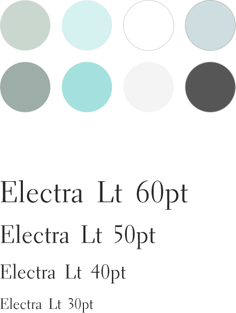
We incorporated a watercolor brushstroke using blue tones from the design’s palette to lend soft movement and color.
One of Cynthia’s choices for colors in the website was an image featuring a eucalyptus limb. We chose to use that image in the site and it found its way into the logo to bring color, softness, and coordination with the website.
The Identity
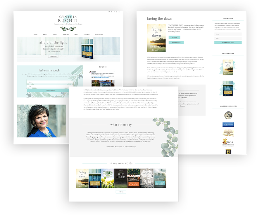
Cynthia’s book covers have been heralded in the publishing industry as some of the more beautiful designs released. To date, one of the best is from her release, Afraid of the Light. Tapping the cover design, we built a color palette of soft blues, light greens, and grays.
We employed the titling font from her logo, Electra, for headings and chose Sofia Pro for the main body of her site’s text.
The Website
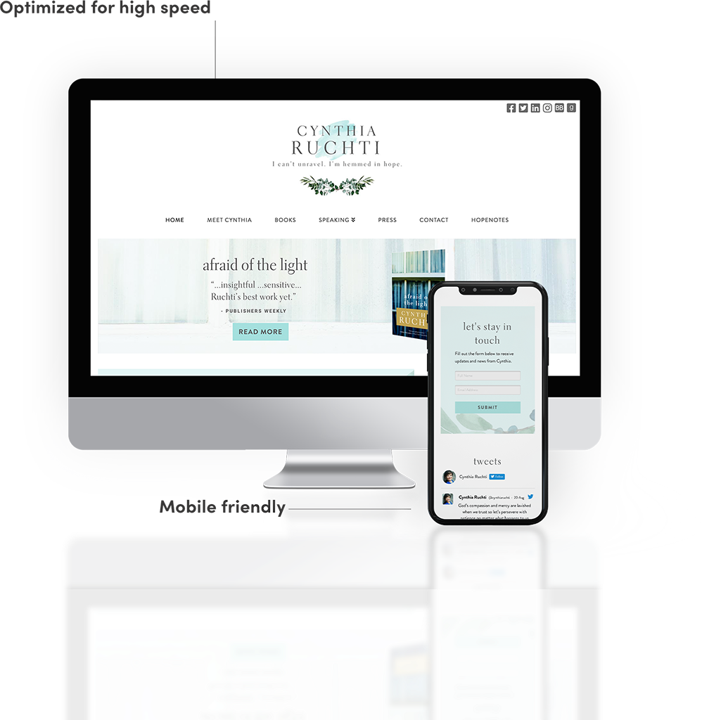
Cynthia’s greatest desire for her new website was discovered in her own words found in her questionnaire: Light, sophistication, & softness. Her primary audience is composed by women and her novels feature challenging and powerful topics of faith and life. Coupled with her growing career as an agent, Cynthia wanted her site visitors to find her books, invite her to speak, and partner with her as an agent, all in a beautiful, sophisticated online space. And so, Jones House delivered.
• Responsive sizing
• Optimal speed
• SEO best practices
• Easy edits through Wordpress Admin