case study
COACHES CAFE
The Vision
Jim Rink, well-known life coach and leadership mentor, approached Jones House to develop branding and online presence for his online coaching consortium, Coaches’ Café.
Client wishlist:
“For Coaches' Café, I wanted something more intimate and safe where people could (virtually) come to talk & share and potentially solve the world’s problems. With my coaching clients, especially those in job transition, I talk about community, belonging, and being (vs doing). I wanted professionalism, scope, depth, and personal engagement.”
Jim Rink, Founder and CEO
The Logo
The client provided a defined logo idea from another one of their businesses as a source of inspiration. Jones House was tasked with developing a complimentary logo that specifically presented Coaches’ Café as a separate, but linked, entity.
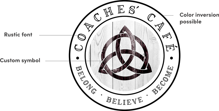
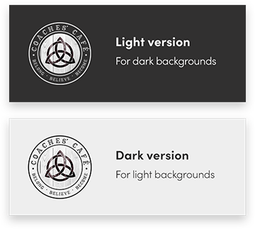
To capture the meeting place/coffee house vibe, we created a badge, easily inverted from light to dark backgrounds, that lends a warm, approachable vibe to the Coaches’ Café brand.
A rustic font surrounding a customized triqueta, inspired by the client, gives the brand a recognizable, printable mark.
The Identity
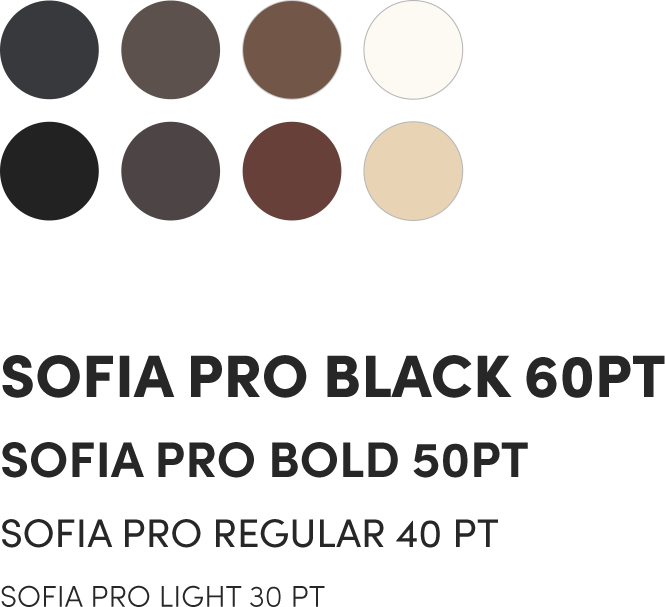
With cafés and coffee houses as the inspiration, the project naturally informed us of its color palette. From dark espressos to light browns and creams, you can almost smell lattes brewing just browsing the site.
We chose Sofia Pro as the brand typeface for its clean, professional appeal.
The Website
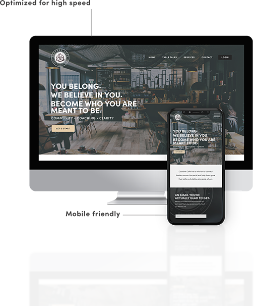
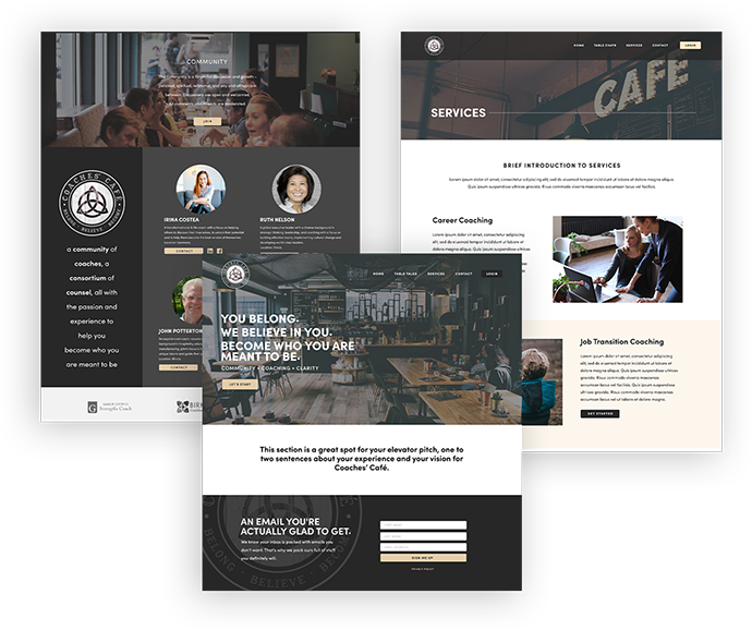
With much traffic drawn from LinkedIN, professional presentation was key. The Coaches’ Café website needed to draw people in and lead them into the online forums for discussion and to the collective of coaches. Using compelling imagery, clear presentation of purpose and calls-to-action, Jones House created a website that accomplishes its goal: connecting people.
• Responsive sizing
• Optimal speed
• SEO best practices
• Easy edits through Wordpress Admin
